


Good design is invisible. It removes friction, guides decisions, and earns trust before a single word is read. Here are the nine principles shaping high-performing digital products right now.
Users decide whether to stay or leave a digital product within seconds, and that window is not won through aesthetics alone. It is won through clarity, intention, and a design that anticipates what people need before they have to ask for it. UX design in 2026 is less about following visual trends and more about cognitive respect, which means building systems that think ahead, communicate honestly, and never leave people feeling lost or uncertain about what to do next. The nine principles below are not theoretical ideals. They are the practical foundation of every high-performing digital product, and the difference between an experience that retains users and one that quietly loses them.
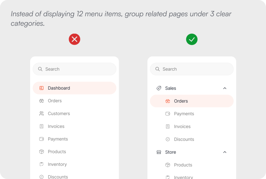
01. Reduce Cognitive Load
Keep decisions simple.
Every additional choice or piece of information presented on screen increases the mental effort required to move forward, and the human brain has a finite capacity for that kind of processing. When an interface asks too much at once, the most common outcome is not a wrong decision but no decision at all. Users stop, disengage, and leave, often without being able to articulate exactly why. Good UX design works with the brain’s natural limitations rather than against them, which means presenting only what a user needs to complete their current task and removing everything else from the equation.
Progressive filtering, contextual content loading, and intelligent defaults are all tools that reduce the cognitive surface area a person has to navigate at any given moment. When the path forward feels obvious and uncluttered, users move through it with confidence, and confidence is what drives completion.
Example: Instead of displaying 12 menu items, group related pages under 3 clear categories.
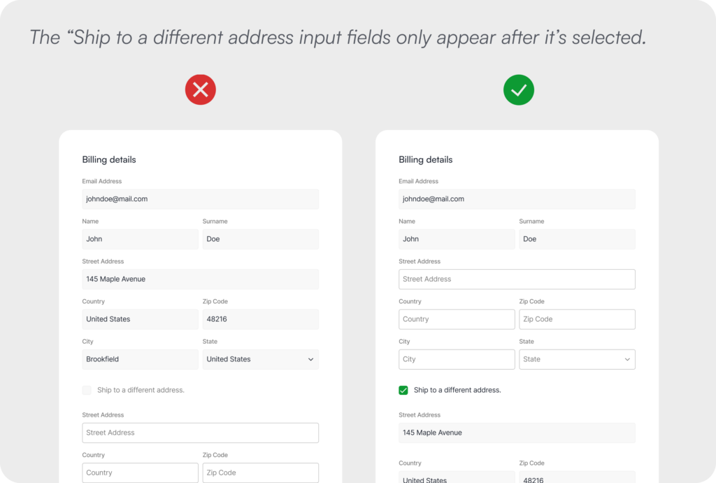
02. Progressive Disclosure
Reveal complexity gradually.
One of the most consistent mistakes in interface design is the impulse to show everything at once, to demonstrate the full power of a product before the user has had the chance to form a reason to want it. Not every user needs every feature at every moment, and front-loading complexity is one of the most reliable ways to create friction where there should be none. Progressive disclosure is the principle of introducing advanced options, additional fields, and deeper functionality only at the moment they become genuinely relevant to what the user is trying to do.
This approach is particularly valuable in onboarding flows, multi-step forms, and settings panels, where the gap between what a new user needs and what a power user expects is widest. By layering information according to context and intent, the experience stays focused and approachable without sacrificing the capability that experienced users depend on.
Example: The “Ship to a different address input fields only appear after it’s selected.
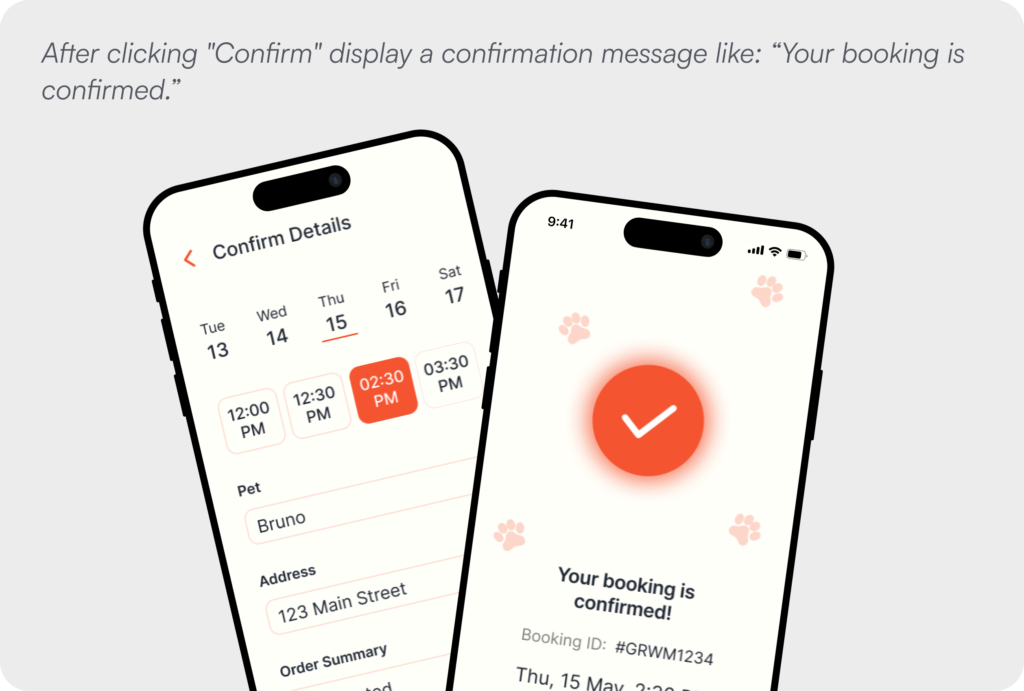
03. Prioritize Clear Feedback
Every action deserves a response.
Silence is one of the most disorienting experiences a digital product can create, and it happens more often than most design teams realise. When a user clicks a button, submits a form, or triggers any kind of system process and receives no visible response, they are left in a state of genuine uncertainty about whether their action registered, whether something is happening in the background, or whether they need to try again. That uncertainty is uncomfortable, and discomfort at a critical moment in a user journey drives abandonment more reliably than almost any other factor.
Every interaction in a well-designed product closes its own loop through clear, immediate feedback, whether that takes the form of a loading indicator, a color state change, a toast notification, or a confirmation message. The specific mechanism matters less than the principle it serves, which is giving users continuous awareness of where they stand so they never have to guess.
Example: After clicking “Confirm” display a confirmation message like: “Your booking is confirmed.”
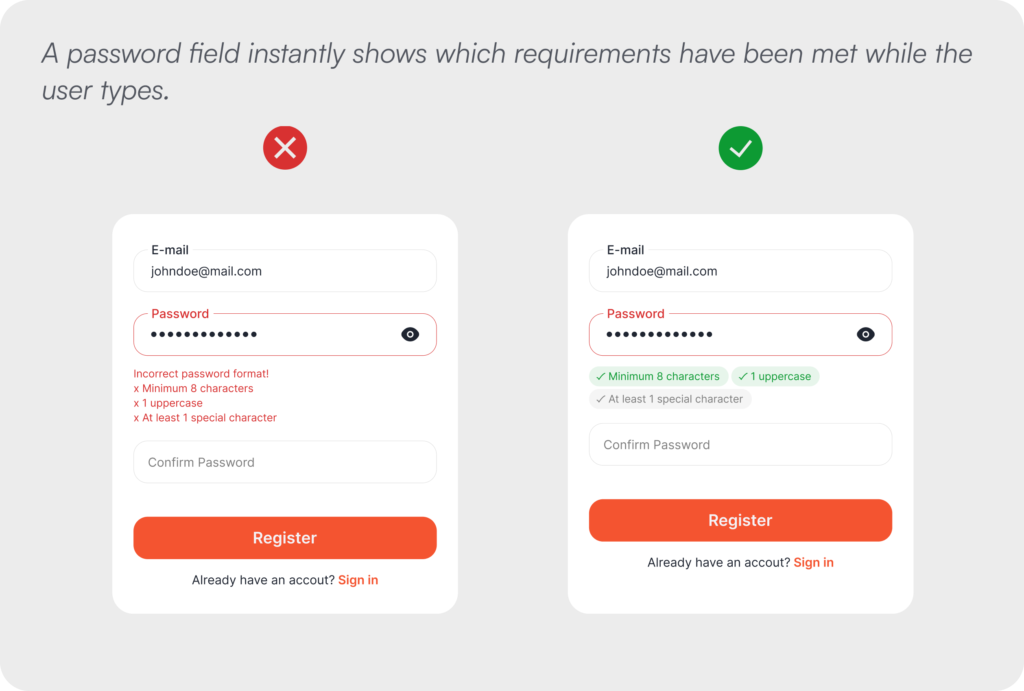
04. Prevent Errors
Help users avoid mistakes before they happen.
The most respectful thing a design can do is protect users from making mistakes in the first place, because the experience of encountering an error after committing to an action is almost always more frustrating than the effort of being guided away from it beforehand. Designing for error prevention means thinking ahead to the points in a flow where users are most likely to go wrong and building in guidance, constraints, and validation that catch problems early rather than surfacing them after damage has been done.
Inline validation that responds as users type, input fields that only accept the correct format, contextual hints that clarify what is expected, and confirmation steps before irreversible actions are all expressions of this principle. The goal is never to make users feel policed or restricted, but to make the right path so clear and well-supported that mistakes become genuinely difficult to make.
Example: A password field instantly shows which requirements have been met while the user types.
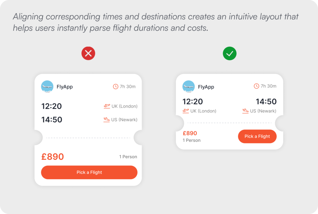
05. Establish Visual Hierarchy
Guide attention intentionally.
Visual hierarchy is the structural language through which an interface communicates what matters most, and when it is working well, users experience it not as design but simply as clarity. The eye is drawn through the screen in a sequence that aligns with the user’s goal, with the most important action receiving the most visual weight and secondary options present but appropriately subordinate. When hierarchy is absent or inconsistent, everything competes for attention equally, the user’s eye has nowhere to land with confidence, and the cognitive load of the interface increases immediately.
Size, typographic weight, color, contrast, whitespace, and spatial positioning all contribute to this hierarchy, and each of them is a design decision with real consequences for user behaviour. The discipline of visual hierarchy is not about making an interface look polished. It is about making the right action feel obvious before the user has consciously processed why.
Example: Aligning corresponding times and destinations creates an intuitive layout that helps users instantly parse flight durations and costs.
06. Reduce User Effort
Make common tasks effortless.
Every unnecessary step embedded in a user flow represents a point at which a user might decide the effort is not worth the reward and leave, and that calculation happens faster and more instinctively than most teams account for. Reducing effort is not simply about making things faster, although speed matters. It is about eliminating the friction that arises when a system requires users to do work that the system itself has the information or capability to handle. Autofill, remembered preferences, pre-populated fields, and smart defaults are not conveniences. They are signals that the product understands its users and respects their time.
This principle carries particular weight in the moments of highest drop-off risk, including checkout flows, account creation, data entry forms, and complex settings management. Each unnecessary field, redundant confirmation, or repeated input is a small tax on the user’s patience, and those taxes accumulate into abandonment.
Example: Allowing users to scan their card eliminates the need to manually type out complex 16-digit numbers.
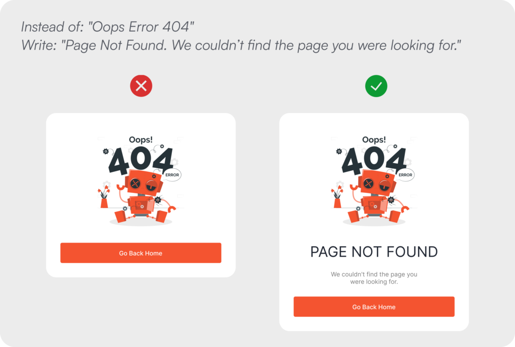
07. Write Human-Friendly Copy
Clear language beats technical language.
Interface copy is a design material in the same way that color, spacing, and typography are design materials, and it deserves the same level of intentionality. The words that appear in error messages, empty states, button labels, confirmation dialogs, and onboarding prompts shape how users feel about a product at the exact moments when they are most uncertain, most frustrated, or most in need of clear direction. Technical language in these moments does not signal professionalism or sophistication. It signals that the product was built without genuine consideration for the people who would use it.
Writing human-friendly copy means naming things by what users recognise and control, not by how the underlying system is structured. It means using active, direct language that tells users what to do rather than describing what the system has done to them. It means treating every word on screen as an opportunity to build trust, and every vague or jargon-filled message as an opportunity missed.
Example: Instead of: “Oops Error 404”, Write: “Page Not Found. We couldn’t find the page you were looking for.”
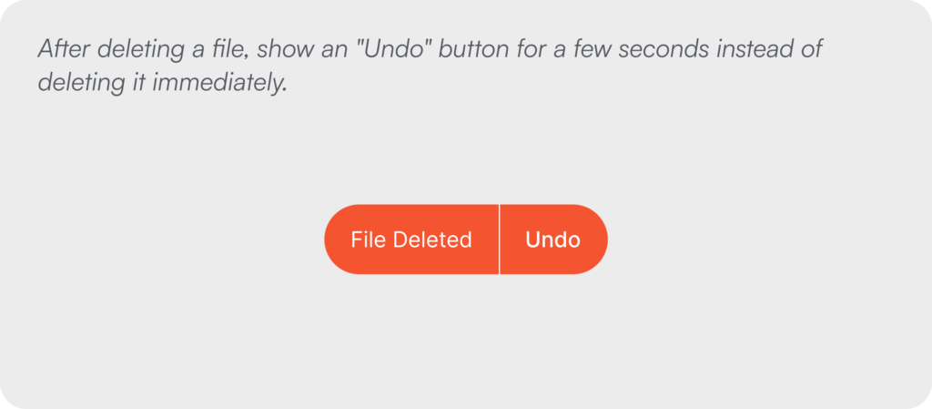
08. Design for Recovery
Mistakes shouldn’t feel permanent.
Users make mistakes in every product they use, and the question is never whether errors will occur but how the system will respond when they do. A product that treats mistakes as the user’s problem to solve creates an atmosphere of anxiety around every consequential action, because users learn quickly that getting something wrong carries a cost they cannot recover from. That anxiety has a compounding effect on long-term engagement, making users more hesitant, less exploratory, and ultimately less invested in the product.
Designing for recovery means treating mistakes as an expected and entirely normal part of using software, and responding to them with tools that restore confidence rather than deepen regret. Undo functions, brief reversal windows before irreversible processes complete, confirmation steps before high-stakes actions, and clear recovery paths after errors all serve this purpose, and their presence changes the emotional register of an interface from punishing to forgiving.
Example: After deleting a file, show an “Undo” button for a few seconds instead of deleting it immediately.
09. Keep Users in Control
Technology should assist, not take over.
As artificial intelligence and automation become standard features of digital products rather than differentiating ones, the question of who is ultimately in control of an experience has become central to how users evaluate and trust the tools they rely on. People are willing to accept intelligent suggestions, automated processes, and AI-generated content when they retain meaningful agency over the outcome, meaning the ability to review what was produced, edit it before it is committed, or decline it entirely without friction. The moment a system removes or obscures that agency, whether through opaque automation, irreversible AI actions, or defaults that are difficult to override, the trust that makes the feature valuable in the first place begins to erode.
This principle applies equally to features that do not involve AI at all. Any functionality that acts on behalf of a user, including automatic scheduling, content sorting, notifications, or data deletion, should surface its reasoning in a way users can understand and preserve their ability to intervene. Control is not just a usability requirement. It is the foundational promise that a product serves its users rather than directing them.
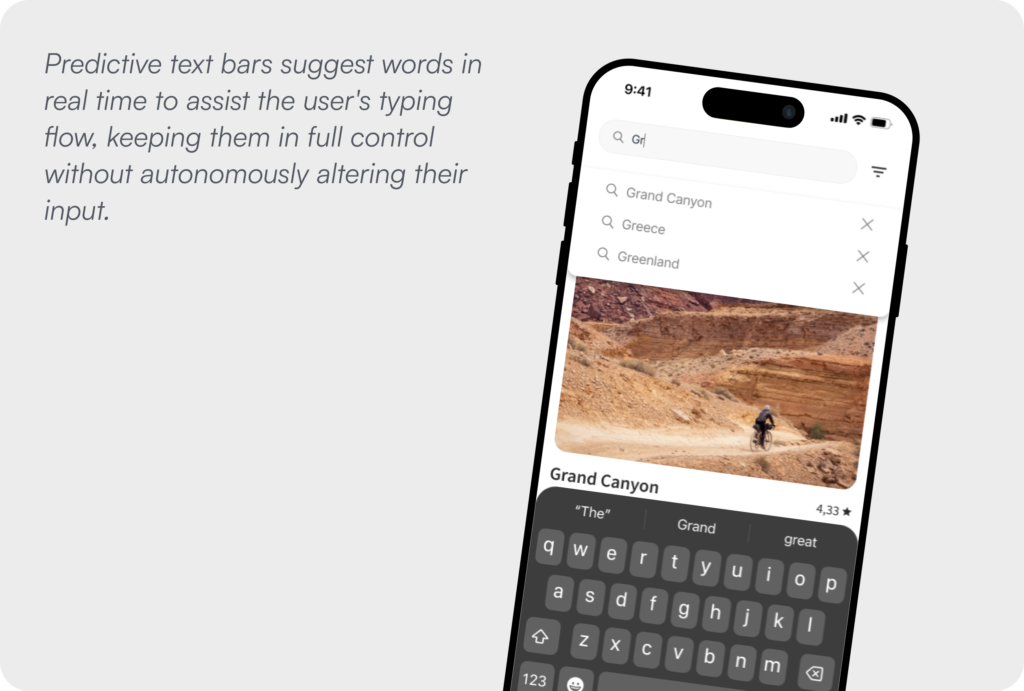
Example: Predictive text bars suggest words in real time to assist the user’s typing flow, keeping them in full control without autonomously altering their input.
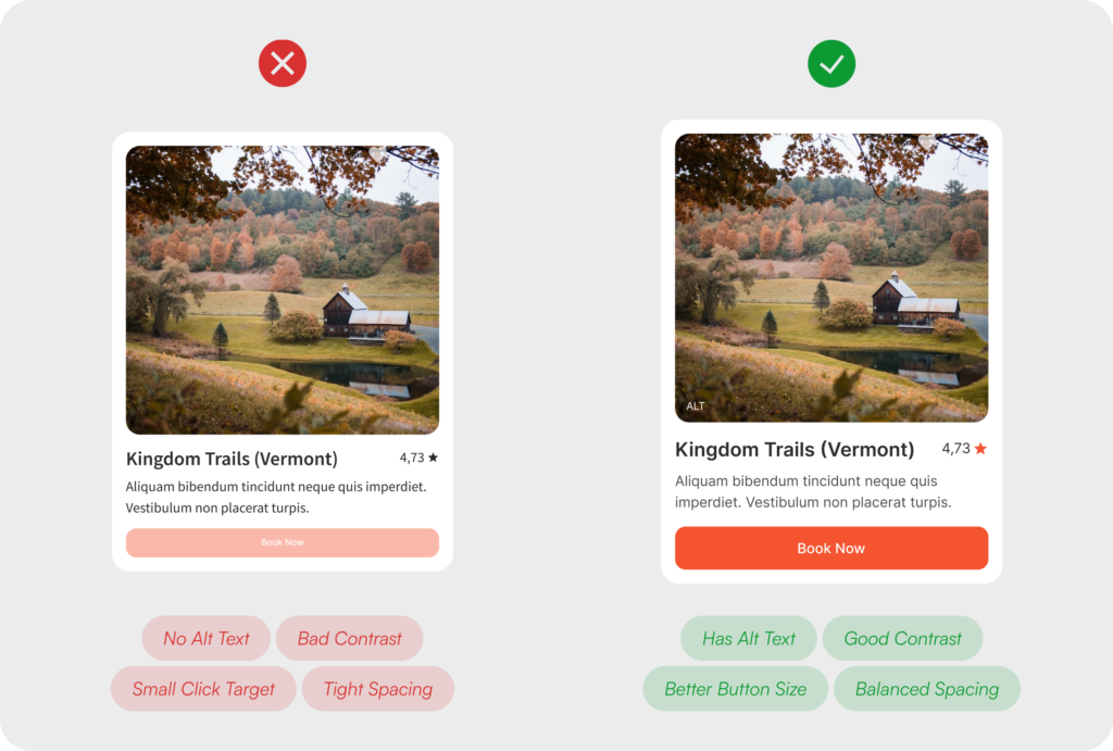
10. Accessibility Benefits Everyone
Design for difference from the start.
Accessibility is not a compliance requirement to be addressed at the end of a project or a consideration reserved for a small subset of users with specific needs. It is the clearest expression of the principle that good design works for everyone, and the evidence for this is overwhelming. Features built to serve users with visual, motor, cognitive, or hearing differences consistently improve the experience for users without those differences as well. Captions benefit users watching video in a noisy environment. High contrast ratios improve readability in bright sunlight. Keyboard navigation serves power users who work faster without a mouse. Designing inclusively does not constrain a product. It refines it.
The structural mistake most teams make is treating accessibility as something to layer onto a finished design rather than a dimension of quality to be considered alongside layout, color, typography, and interaction from the very beginning. By the time a product reaches accessibility review, the decisions that most determine whether it is genuinely inclusive have already been made and are expensive to revisit.
Good UX is a product decision, not a finishing touch. The teams that build the most trusted digital products treat design as infrastructure, not decoration.